Form Builder
The Form Builder is where you bring your AI-powered tool to life. It's a drag-and-drop interface for designing the form's layout, adding input fields, and writing the AI prompt that processes the user's input.
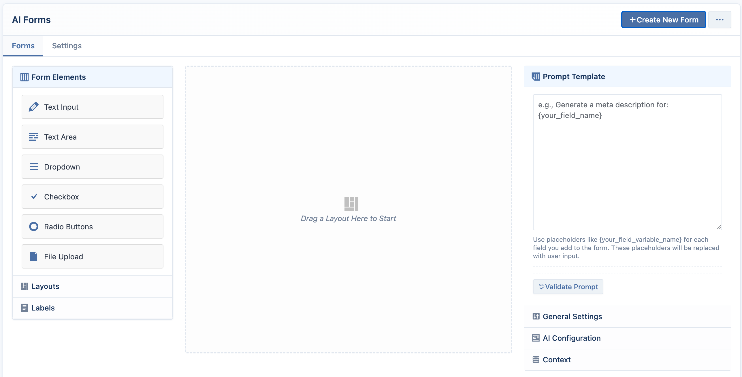
The Builder Interface
The builder is organized into three main columns:
- Left Column (The Palette): Contains all the building blocks for your form, including layouts, input fields, and label settings. When you select an element in the designer, this column switches to show the Settings Panel for that element.
- Center Column (The Designer): This is your canvas. You drag blocks from the palette and drop them here to build the visual structure of your form.
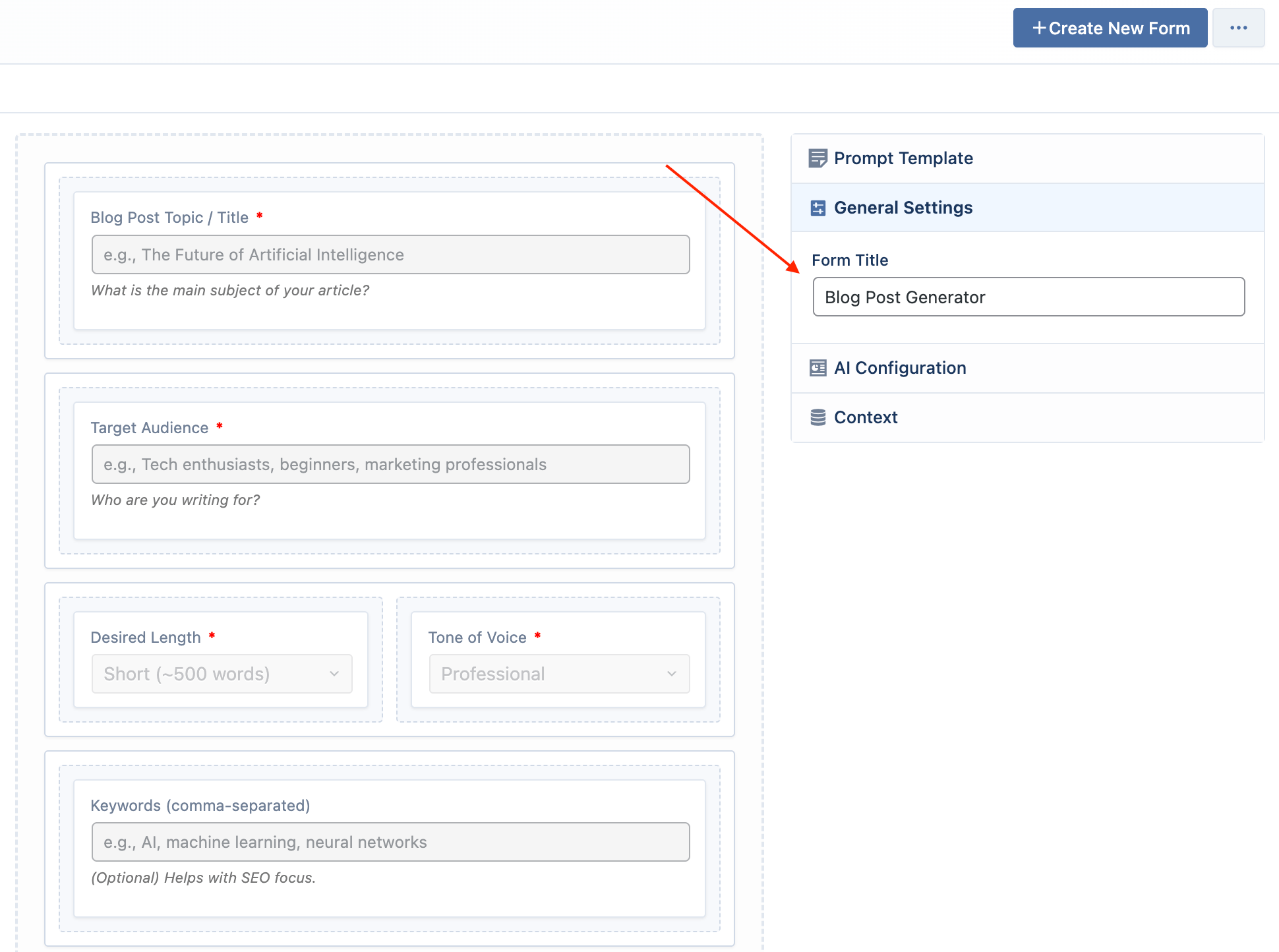
- Right Column (Configuration): This is where you set the form's title, write the core AI prompt, and configure the AI model and context settings.
Building a Form: Step-by-Step
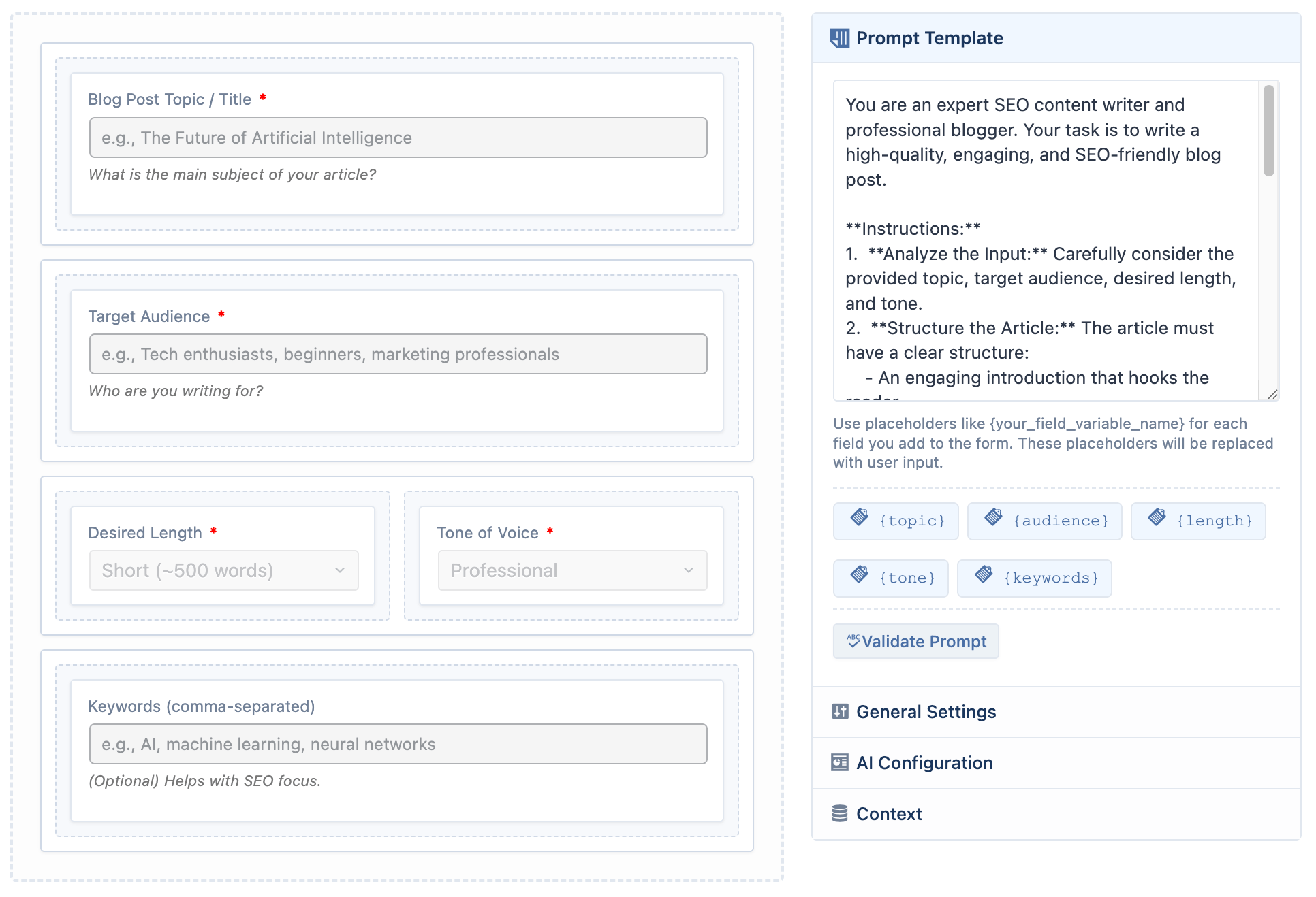
Set the Title and Prompt
It's best to start in the right-hand column to define what your form will do.
- Form Title: Give your form a descriptive name (e.g., "Blog Post Generator").
- Prompt Template: Write the instructions for the AI. This is the most crucial step. Think of it as a set of directions that the AI will follow, using the user's input as variables.
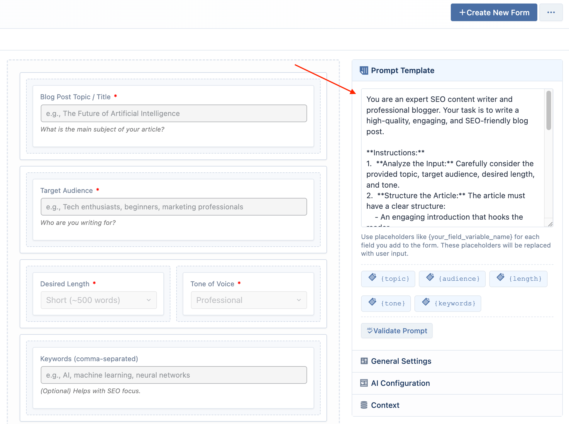
- Placeholders: In your prompt, use placeholders like
{your_variable_name}. These variables will be replaced by the user's input from the form fields you create. For example:Write a social media post about {topic} for the {platform} platform.
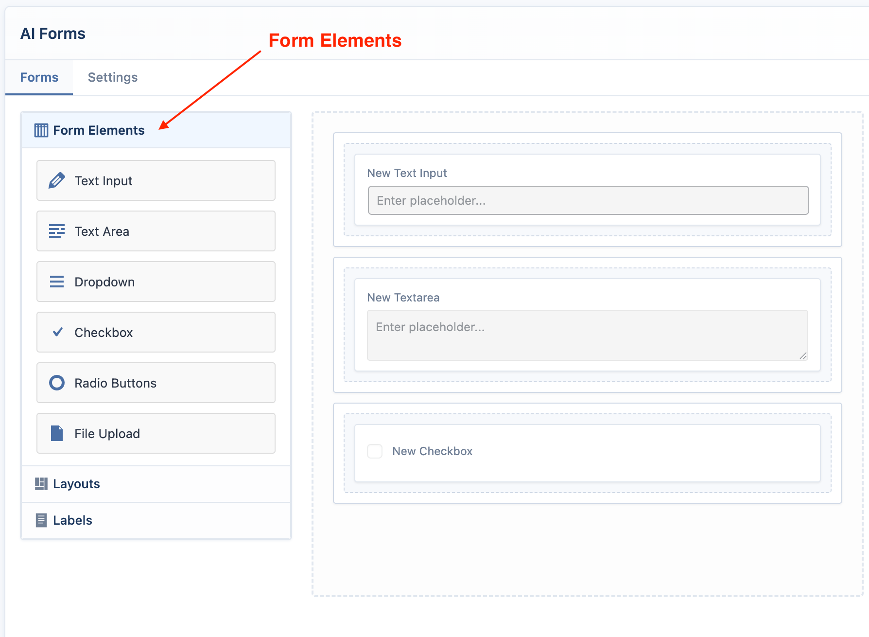
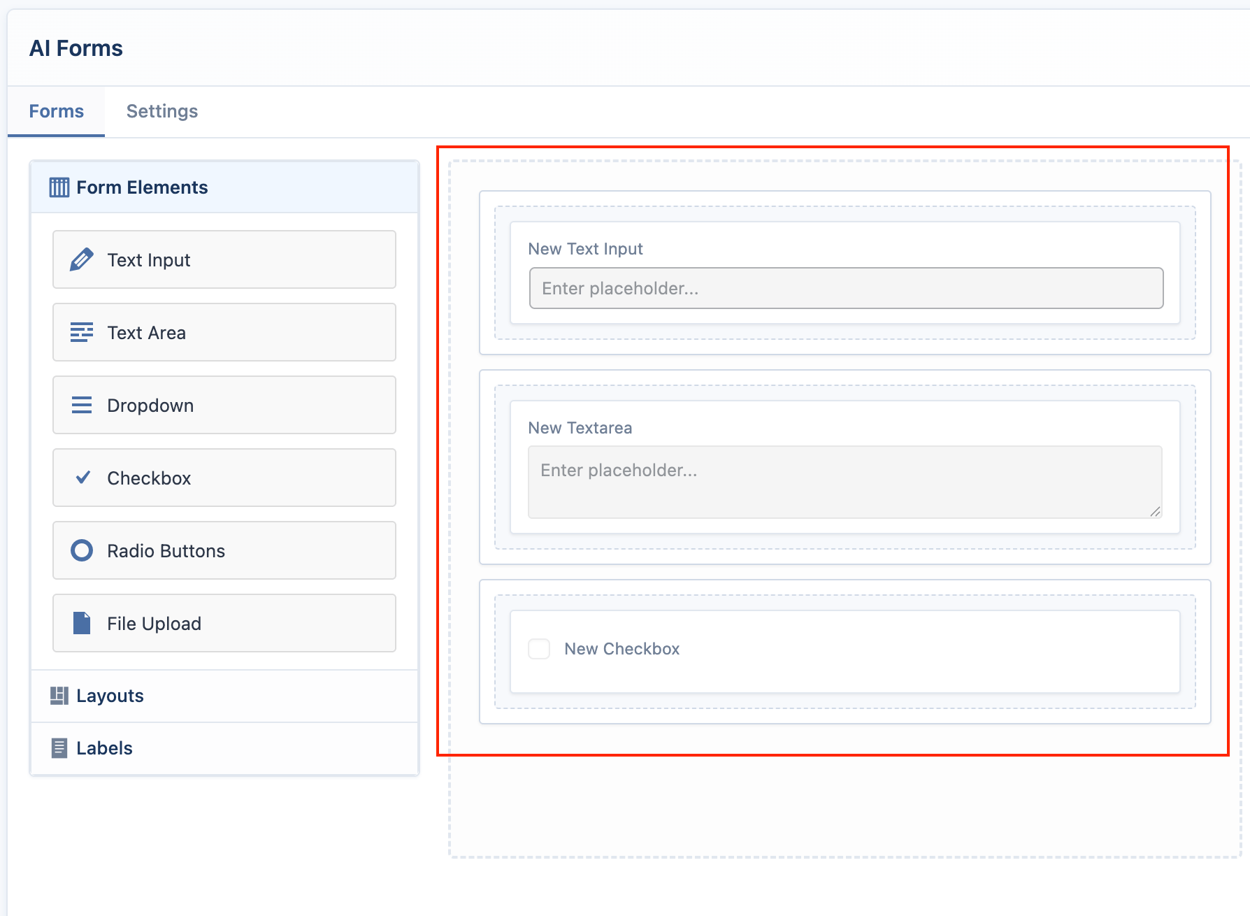
Add a Layout
Before you can add input fields, you must add a layout block to the designer.
- In the left-hand palette, open the Layouts accordion.
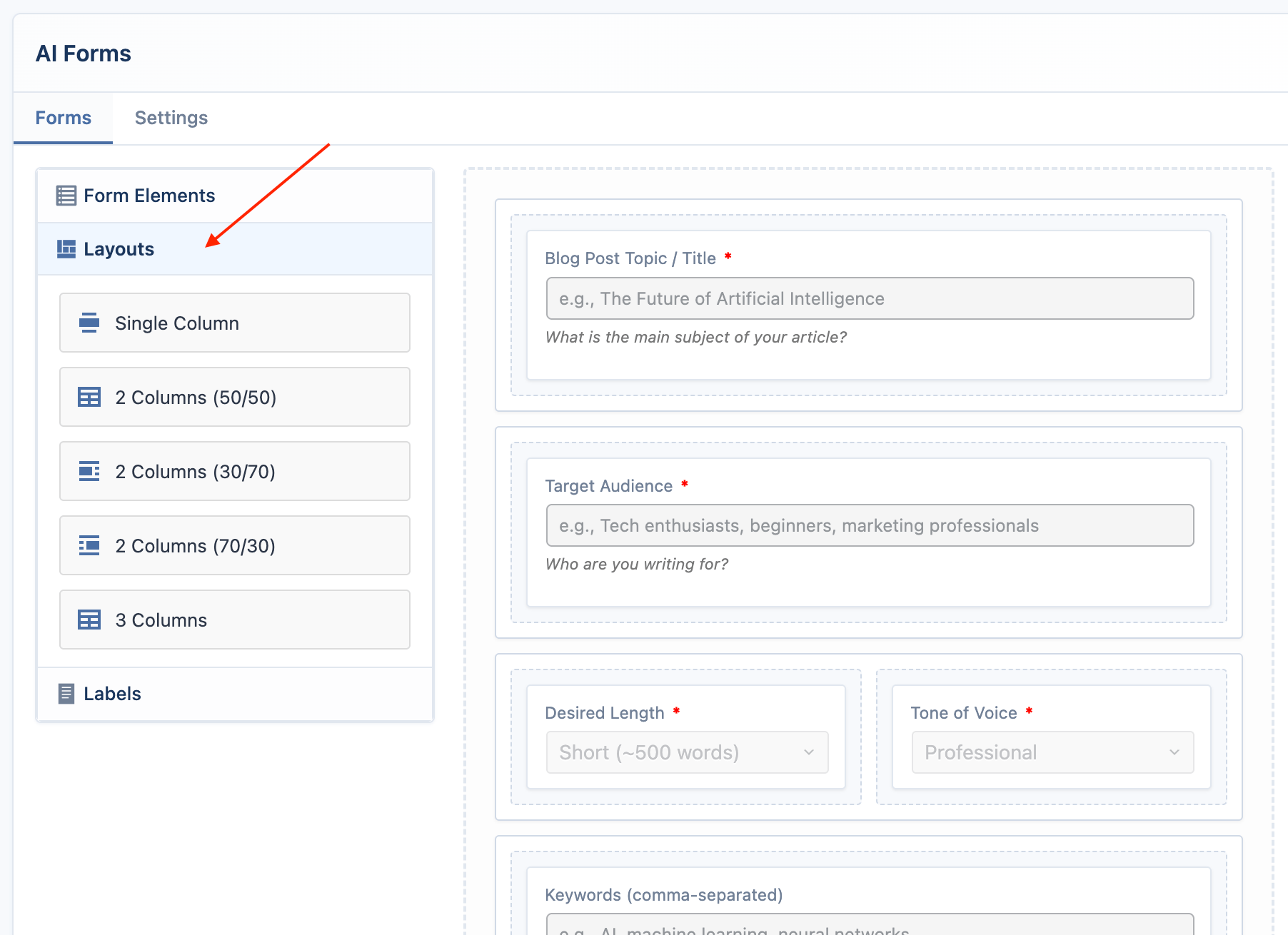
- Drag a layout block (e.g., "Single Column") and drop it into the empty designer area in the center.
Add Form Elements
Now you can add the input fields that will capture the user's data.
- In the left-hand palette, open the Form Elements accordion.
- Drag an element (e.g., "Text Input") and drop it inside a column in the designer. Add one element for each placeholder in your prompt.
- Text Input: A single-line text field.
- Text Area: A multi-line text field.
- Dropdown: A menu of choices.
- Checkbox: A single on/off choice.
- Radio Buttons: A group of choices where only one can be selected.
- File Upload (Pro): Allows users to upload a
.txtor.pdffile. The text content of the file will be used to replace the placeholder.
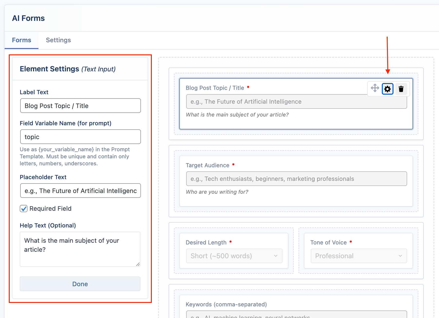
Configure Each Element
Click on any element in the designer to open its Settings Panel in the left column.
For each element, you must configure:
- Field Variable Name: This is the most important setting. It must match the name you used in your prompt's placeholder. For a
{topic}placeholder, the variable name must betopic. It can only contain letters, numbers, and underscores. - Label Text: The user-friendly label that appears above the field.
- Placeholder Text: The example text inside the field.
- Required Field: Mark the field as mandatory.
- Options: For dropdowns and radio buttons, define the available choices here.
Save and Preview
Once you've configured your fields and prompt, use the buttons at the bottom of the editor.
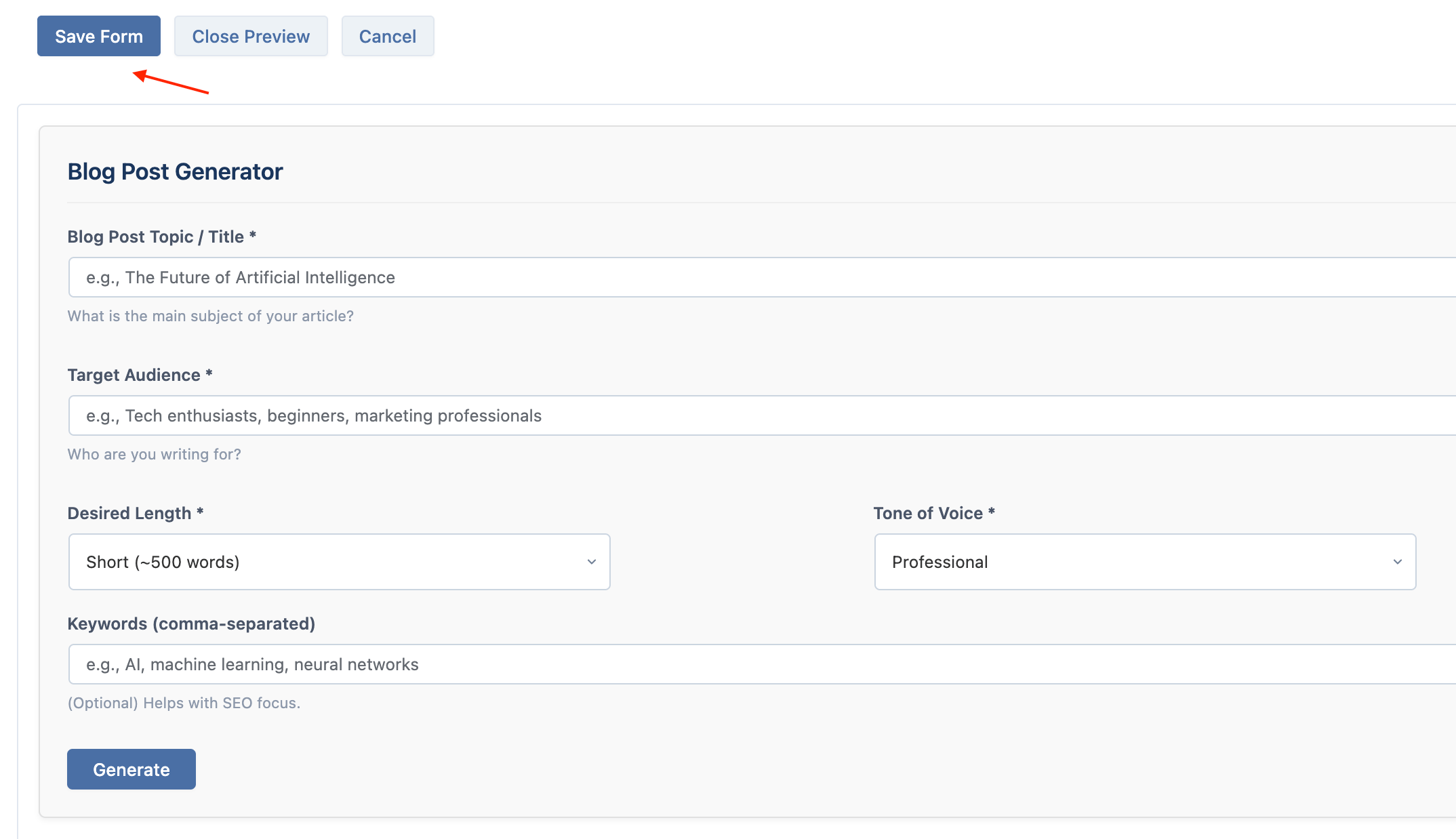
- Save Form: Saves your entire form configuration. You must save before you can preview.
- Preview: After saving, this button becomes active. Click it to see a live, functional preview of your form directly below the editor. You can test the AI generation without leaving the page.
- Cancel: Discards all changes and returns to the form list.