Overview
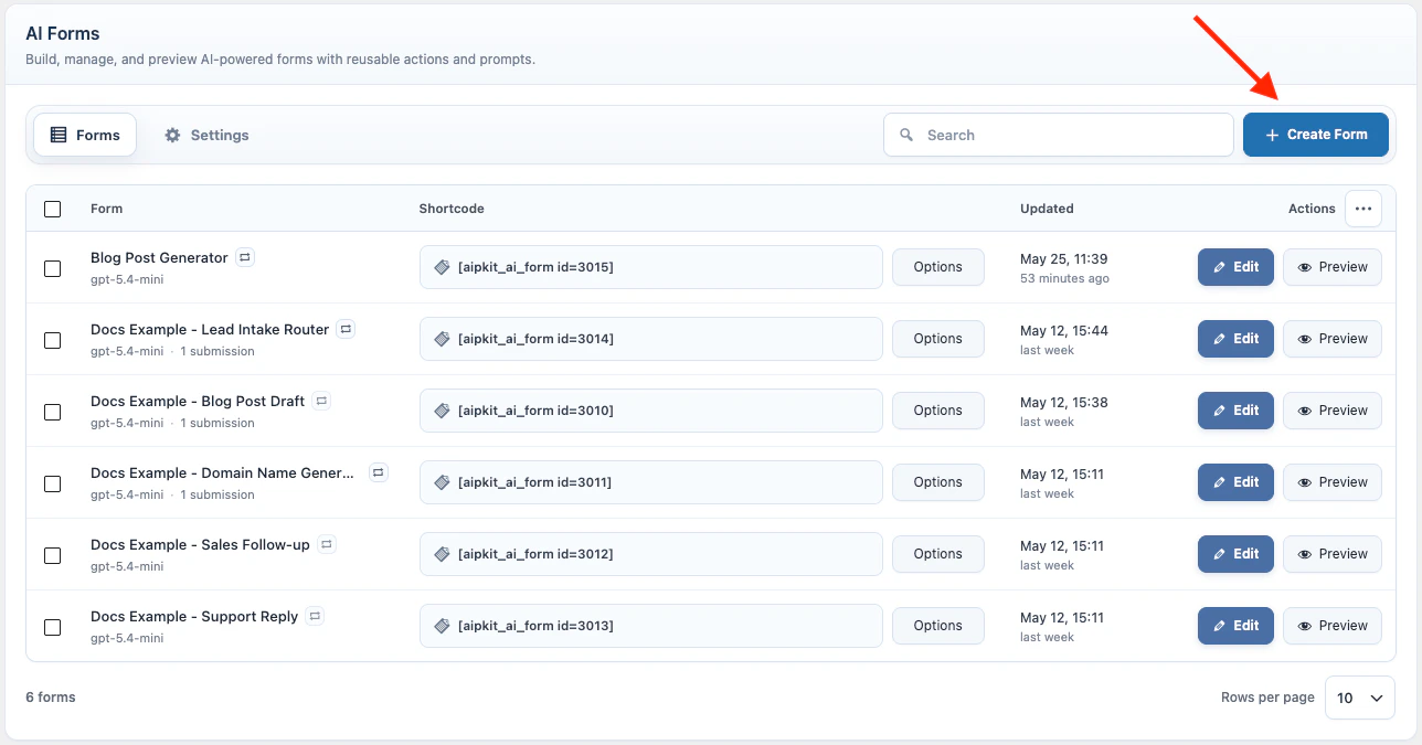
AI Forms collect visitor input, uploaded files, and uploaded images, insert the submitted values into a prompt, stream the AI response on the page, and can pass results into another AI Form. Use them for generators, support reply tools, calculators, lead forms, summaries, guided intakes, and multi-form workflows where the visitor provides structured input. In WordPress admin, go to AI Puffer > AI Forms. Use the Forms tab to create, search, edit, preview, and publish forms. Use the Settings tab for module-wide limits, custom CSS, and frontend model access.Live AI Forms demos
Open example forms built with AI Puffer.
Create a Form
Build fields, layouts, labels, prompt, and AI settings.
Knowledge Base
Use vector data as context for form responses.
Web Search
Let supported providers search the web during a response.
Connected Apps
Send form submissions and outputs to external apps.
Workflow
Chain AI Forms together and pass answers between forms.
Manage Forms
Edit, duplicate, delete, and organize saved forms.
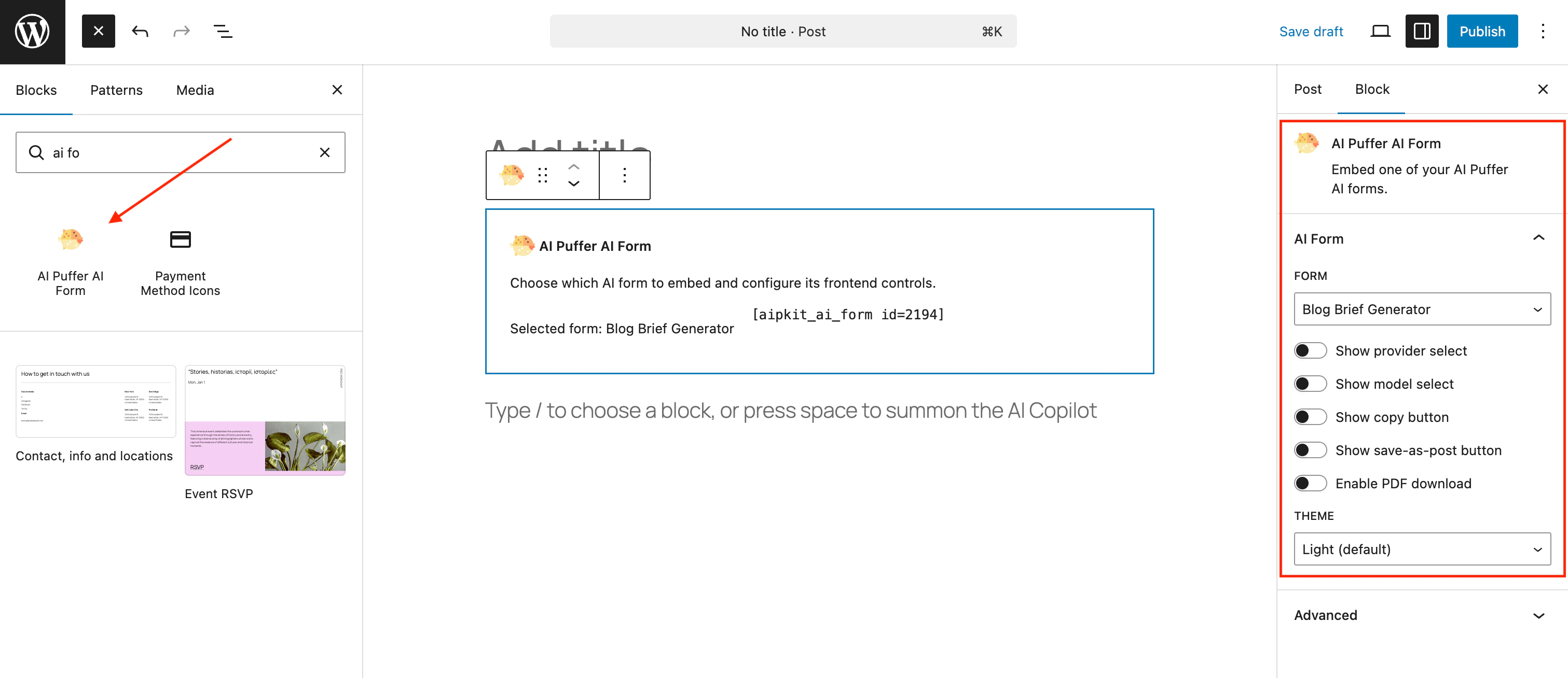
Publish
Embed forms with shortcodes or the WordPress block editor.
Settings
Configure the Limits, Custom CSS, and Frontend Models tabs.
Logs
Review form requests and generated responses.
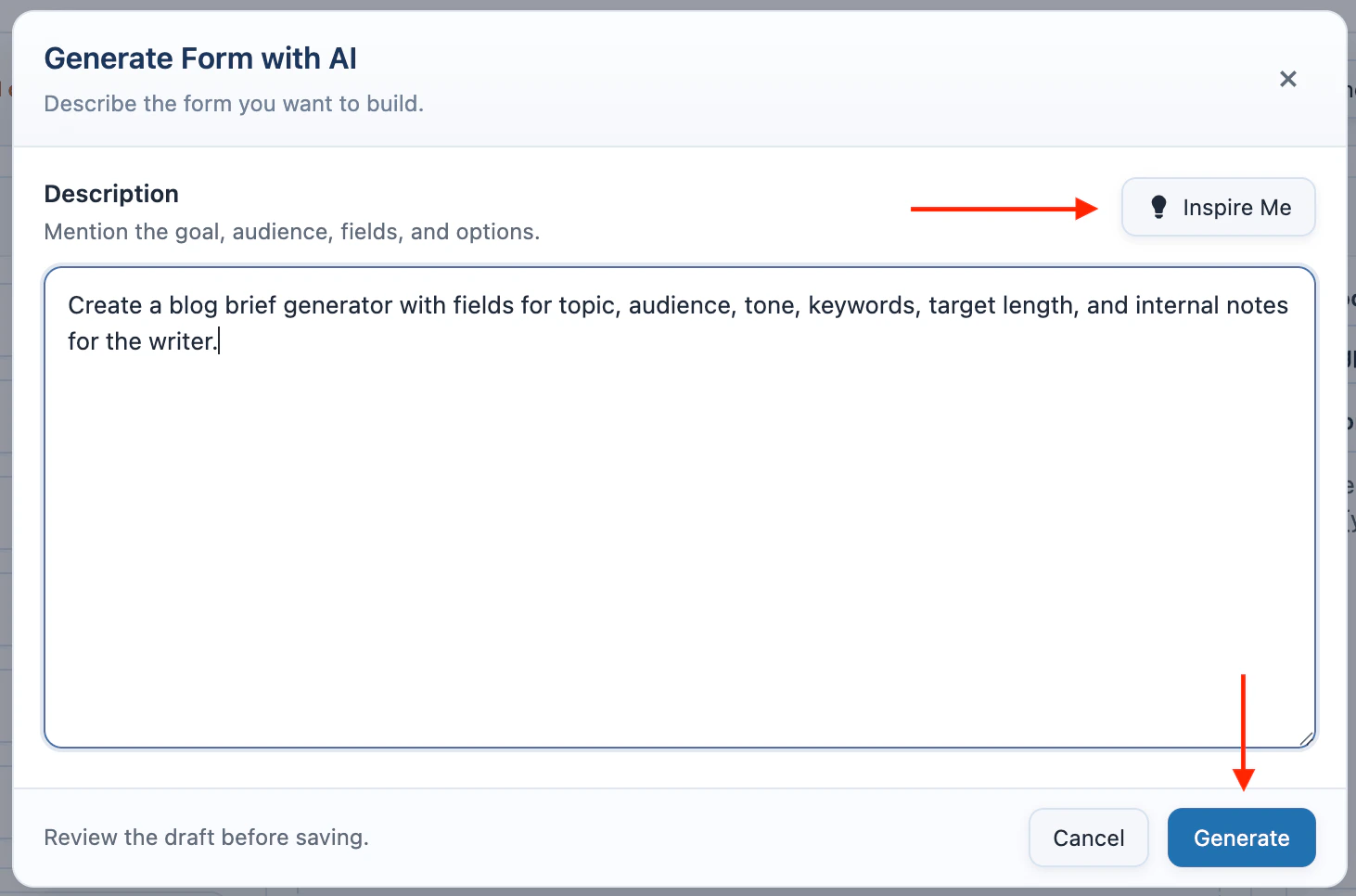
Create a Form
- Open AI Puffer > AI Forms > Forms.
- Click Create New Form.
- Enter the form title.
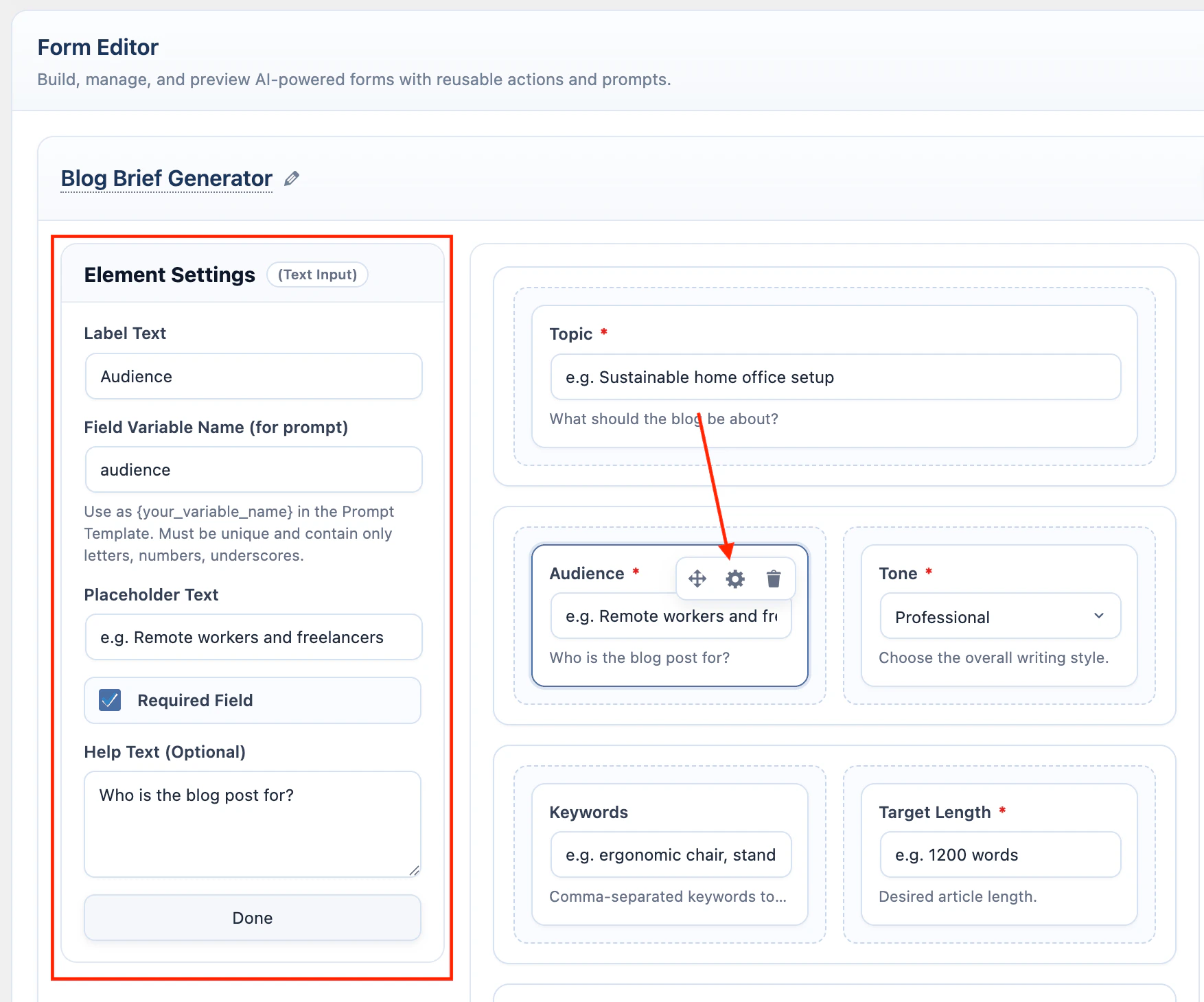
- In the left Layouts accordion, drag a layout into the center designer.
- In the left Form Elements accordion, drag fields into the layout columns.
- Click a field in the designer to edit it in Element Settings.
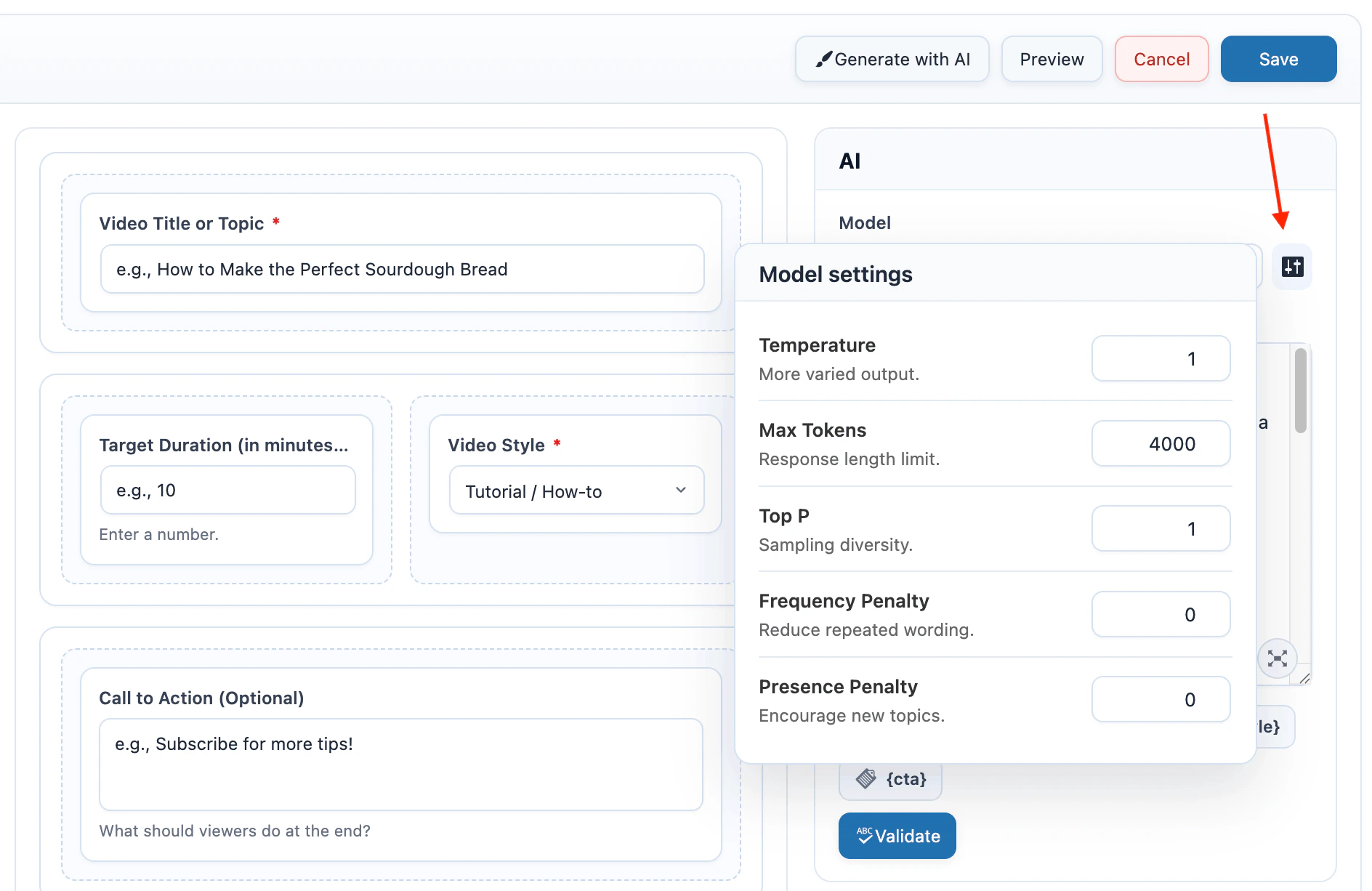
- In the right AI container, select the model.
- Write the form prompt in the AI container.
- Click Validate Prompt to check field placeholders.
- Click Save.
- Click Preview to test the form from the admin screen.
Set up at least one AI provider before creating a form. If the model list is empty, configure and sync a provider in AI Providers.
Form Elements
Form elements collect the values used by the prompt.
When you click a field, Element Settings replaces the left palette. Edit Label Text, Field Variable Name, placeholder text, required state, help text, and options.
File Upload sends extracted text in the prompt. It works with the AI Forms text providers: OpenAI, Google, Anthropic, OpenRouter, Azure, xAI, Ollama, and DeepSeek. It does not use Knowledge Base or vector provider settings.
Layouts
Layouts control the frontend rows and columns.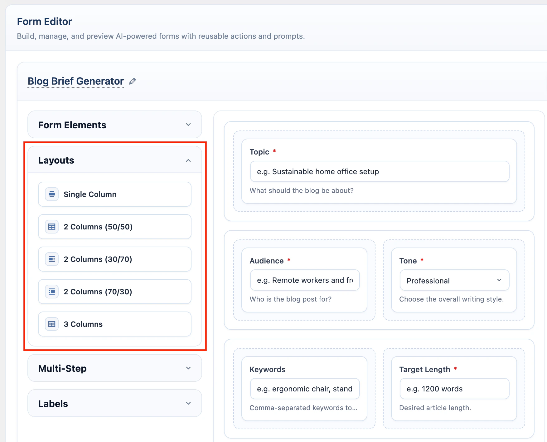
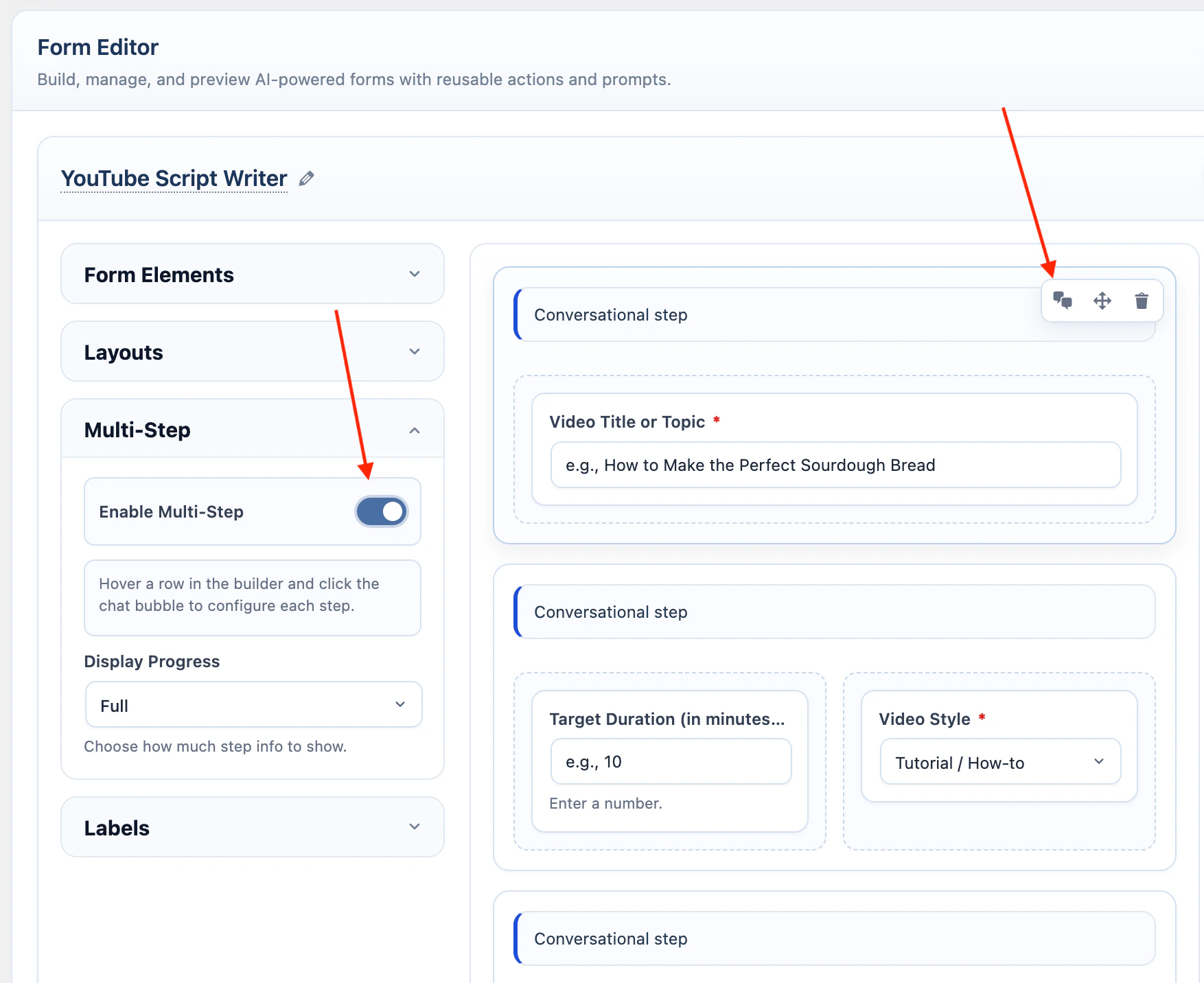
Multi-Step
Multi-Step shows one layout row at a time. Use it when the form should feel like a guided flow. In the left Multi-Step accordion:- Turn on Enable Multi-Step.
- Choose Display Progress.
- Hover a row in the designer.
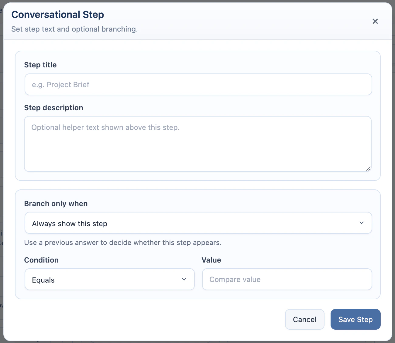
- Click the chat bubble icon to configure that row as a step.
- Add a step title and description if needed.
- Add a condition if the step should appear only for specific answers.
- Save the form.
Skipped step inputs are cleared before submission.
Multi-Step can be combined with Workflow. The visitor completes the visible steps in the source form first; after the AI response finishes, the next workflow form appears.
Workflow
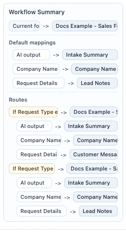
Workflow connects one AI Form to another. Use it when a visitor should complete a source form, review the AI response, and continue with a second form that already contains context from the first result. Workflow is useful for intake funnels, content pipelines, lead routing, support triage, and any process where one AI output becomes the starting point for another AI task.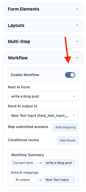
- Create and save the target AI Form first.
- Edit the source AI Form.
- Turn on Enable Workflow.
- Choose the default Next AI Form.
- Use Send AI output to to prefill a target text field with the source form’s AI response.
- Click Add Mapping under Map submitted answers to pass source answers into target text fields.
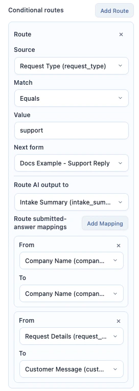
- Click Add Route under Conditional routes if different answers should open different target forms.
- Optional: turn on Auto-submit next form if the next form should run as soon as mapped values are filled.
- Save the source form.
- Test the source form with Preview or its shortcode.
Workflow mappings can target Text Input and Text Area fields in the next form. File Upload and Image Upload fields are not prefilled into the target form.
Conditional routes can check the AI response or a submitted field value. Route operators are equals, contains, and not empty. Routes are checked from top to bottom; the first matching route wins. If no route matches, AI Puffer uses the default Next AI Form.
Workflow does not auto-submit the next form unless Auto-submit next form is turned on. Use auto-submit only when the target form can run from mapped text values. If required values are missing, or the target form needs a required upload or multi-step interaction, the target form waits for the visitor.
Examples
Domain idea to blog post
Domain idea to blog post
Use this workflow when the first form suggests domain names and the second form turns the selected direction into a launch blog post draft.Create the target form first: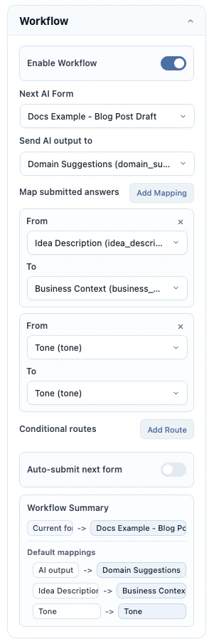
- Create Blog Post Draft.
- Add a Text Area field named
domain_suggestions. - Add a Text Area field named
business_context. - Add a Text Input field named
tone. - Write a prompt that chooses a strong domain from
{domain_suggestions}and writes a blog post using{business_context}and{tone}. - Save the form.
- Create Domain Name Generator.
- Add a Text Area field named
idea_description. - Add a Dropdown field named
tone. - Write a prompt that suggests domain names from
{idea_description}and{tone}. - Open Workflow.
- Turn on Enable Workflow.
- Set Next AI Form to Blog Post Draft.
- Set Send AI output to to
domain_suggestions. - Add a mapping from
idea_descriptiontobusiness_context. - Add a mapping from
tonetotone. - Optional: turn on Auto-submit next form if you want the blog post draft to start immediately after domain ideas are generated.
- Save and test the source form.
Lead intake router
Lead intake router
Use this workflow when one intake form should route visitors to different next forms based on their request type.Create the target forms first: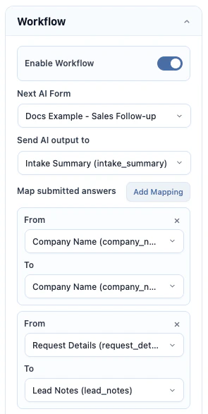
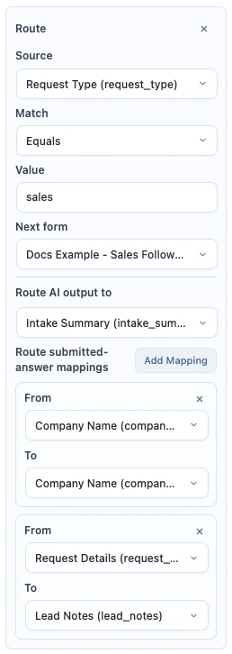
- Create Sales Follow-up with fields named
company_name,intake_summary, andlead_notes. - Write a prompt that drafts a sales follow-up from those fields.
- Create Support Reply with fields named
company_name,intake_summary, andcustomer_message. - Write a prompt that drafts a support reply from those fields.
- Save both target forms.
- Create Lead Intake Router.
- Add a Text Input field named
company_name. - Add a Dropdown field named
request_typewith values such assales,support, andpartnership. - Add a Text Area field named
request_details. - Write a prompt that summarizes the lead from
{company_name},{request_type}, and{request_details}. - Open Workflow.
- Turn on Enable Workflow.
- Set Next AI Form to Sales Follow-up as the default route.
- Add a route where
request_typeequalssupport, then set the target to Support Reply. - In that route, map AI output to
intake_summary,company_nametocompany_name, andrequest_detailstocustomer_message. - Add a route where
request_typeequalssales, then set the target to Sales Follow-up. - In that route, map AI output to
intake_summary,company_nametocompany_name, andrequest_detailstolead_notes. - Optional: turn on Auto-submit next form if each routed target form has everything it needs from the mappings.
- Save and test the source form with both request types.
Labels
Use the left Labels accordion to change frontend button text and field selector labels.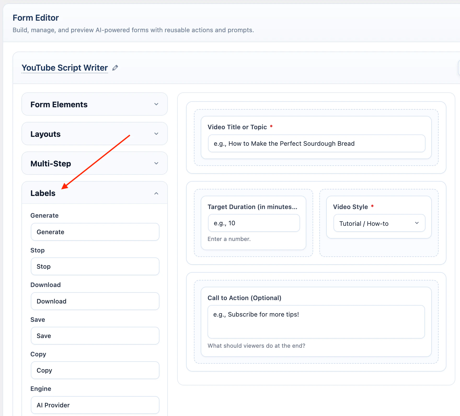
Multi-step labels are used only when Multi-Step is enabled.
AI
Each form has its own model selection in the right-side AI container.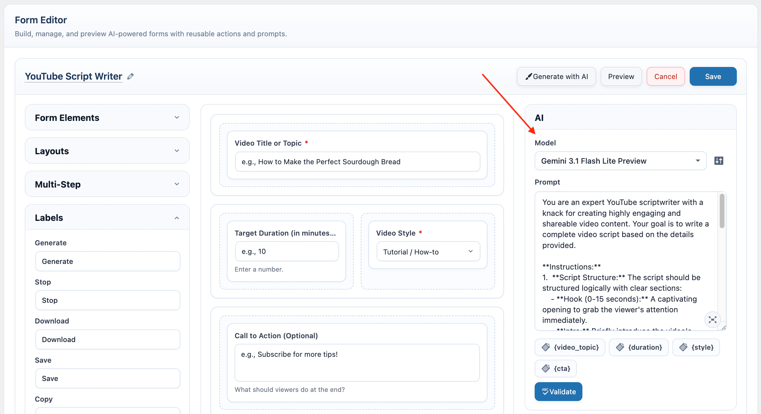
Prompt
AI Forms use field placeholders inside the prompt. Add a field value by wrapping its variable name in braces.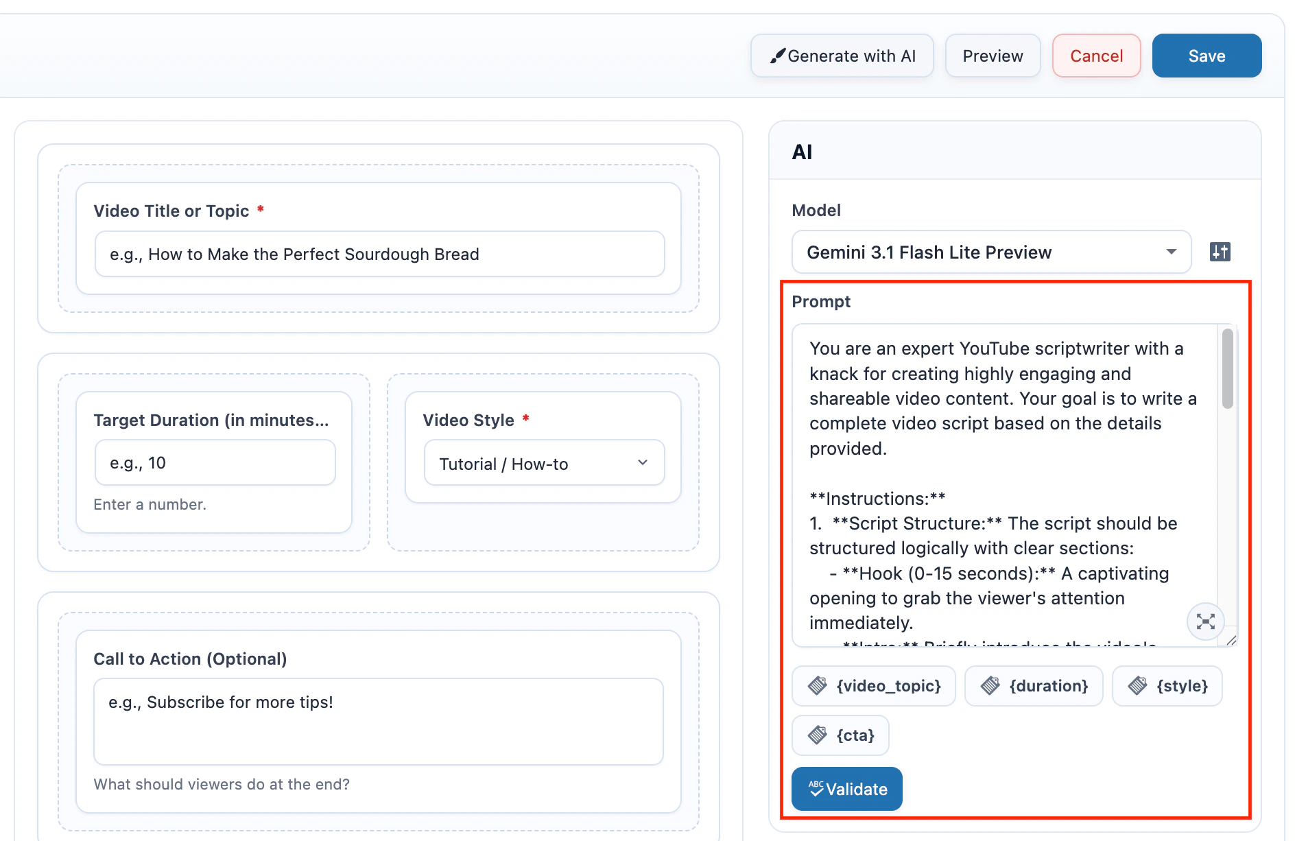
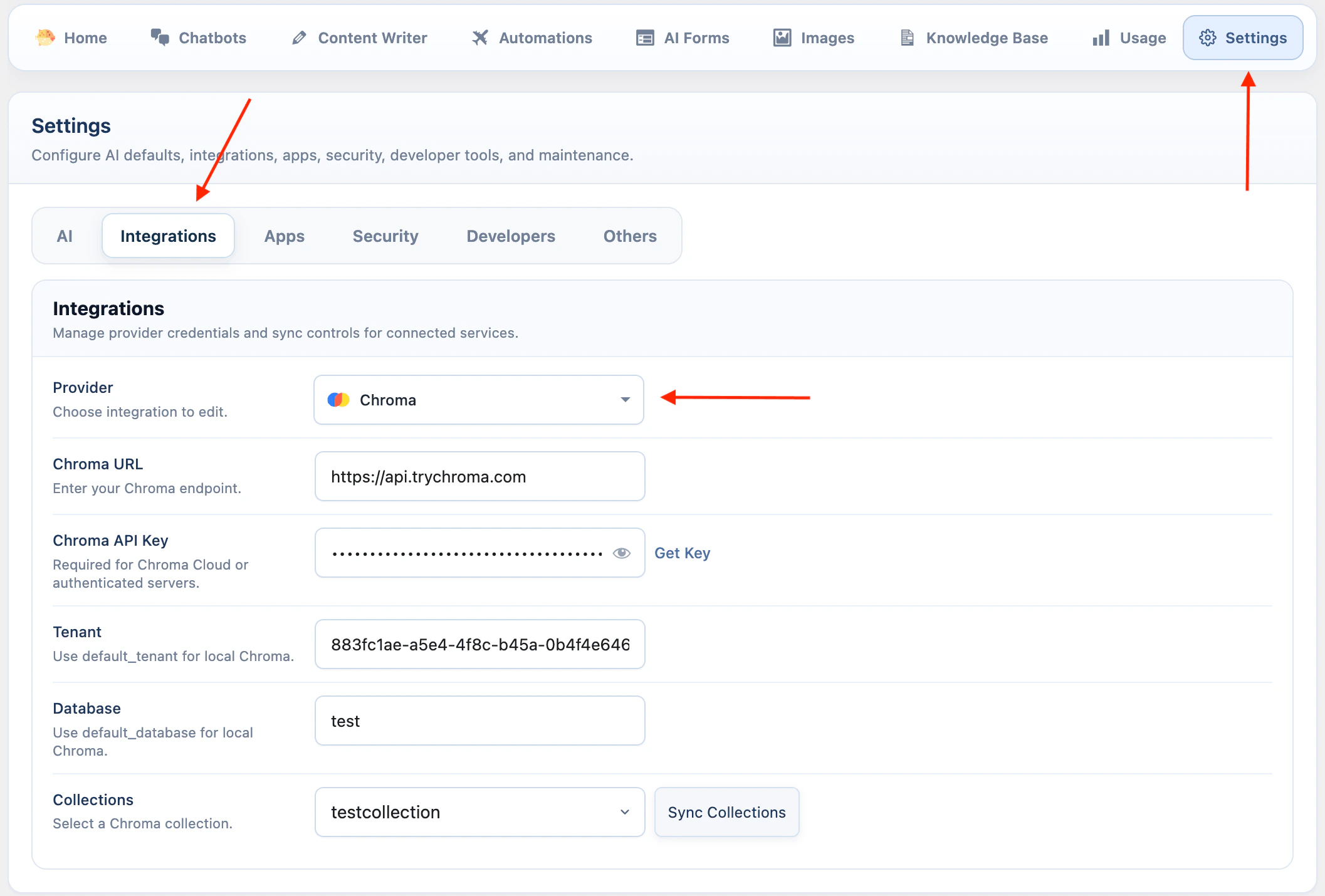
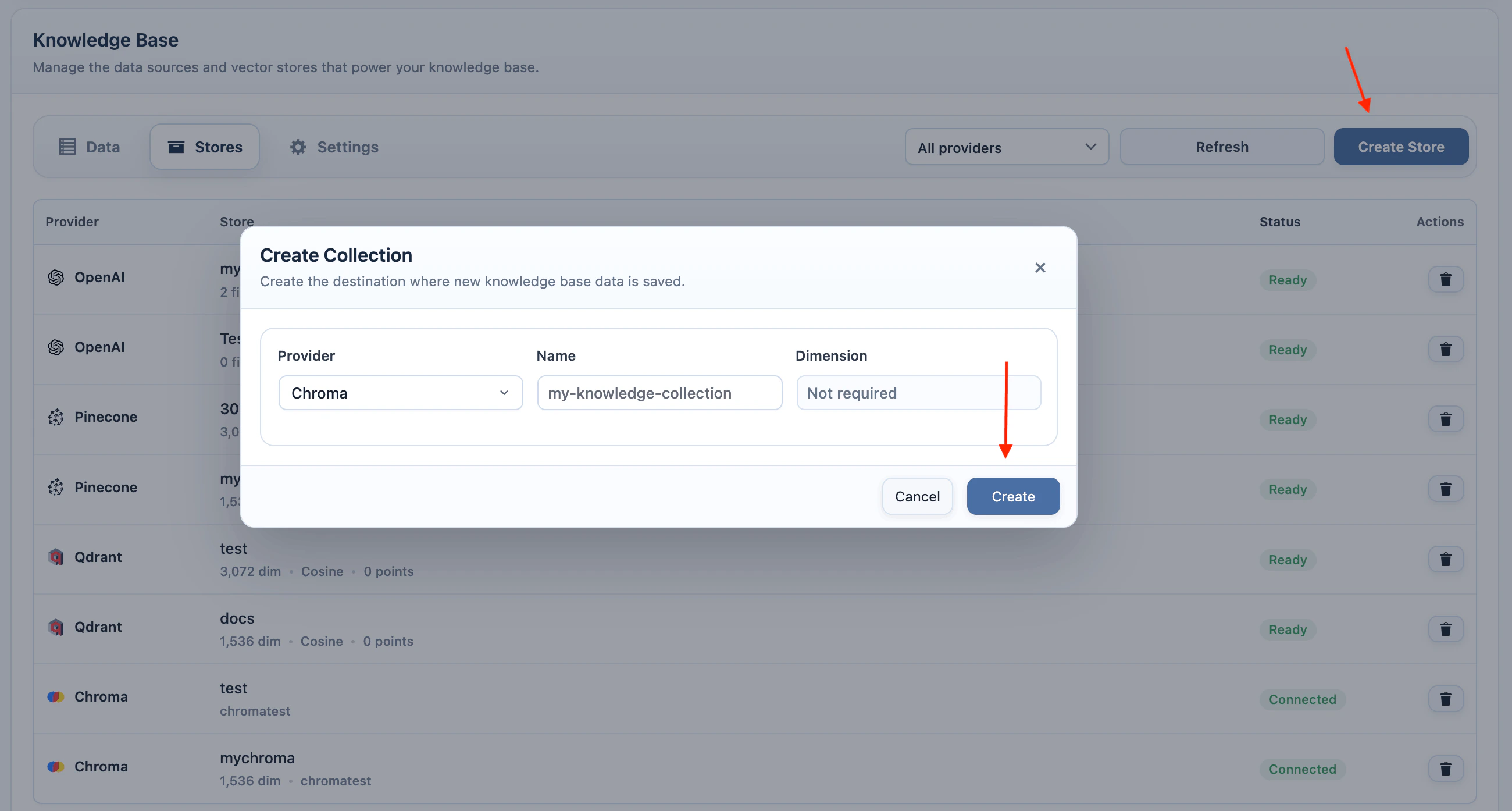
Knowledge Base
Knowledge base lets a form use trained content from AI Puffer > Knowledge Base > Data before generating the response. Use the right-side Context container to enable Knowledge Base and configure its retrieval options.- Turn on Knowledge Base.
- Click the settings icon beside Knowledge Base.
- Select Vector provider.
- Choose the vector store, index, or collection.
- For Pinecone, Qdrant, or Chroma, select the same Embedding model used when the content was indexed.
- Set Limit and Score threshold.
- Save the form.

For Chroma, configure the connection and collection in AI Puffer > Settings > Integrations and AI Puffer > Knowledge Base > Stores first.
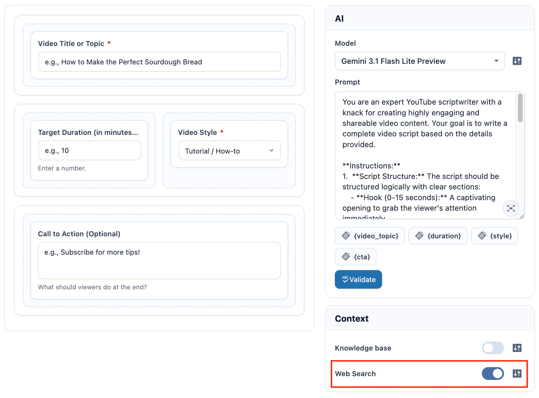
Web Search
Web search lets supported providers use current web results while generating the form response. Use the right-side Context container to enable Web Search. The available options depend on the selected model provider.- Select an OpenAI, Google, Anthropic, OpenRouter, or xAI model.
- Turn on Web Search.
- Click the settings icon beside Web Search.
- Configure the provider options.
- Save the form.
- OpenAI
- Google
- Anthropic
- OpenRouter
Connected Apps
Connected Apps send completed form submissions to external apps through recipes. Theform.submitted event is emitted after the AI response is complete, so mappings can use both submitted inputs and the generated response. Image Upload fields include image metadata in the event payload, not the base64 image data.
Supported destinations are Slack, HubSpot, Notion, Pipedrive, Zapier, Make, and n8n.
Connected Apps can be used with Workflow. Each submitted form in the chain emits its own form.submitted event, so a source form and a target form can trigger separate recipes. When Auto-submit next form is enabled, the target form can emit its own event without another visitor click.
- Go to AI Puffer > Settings > Apps.
- Connect the app account or webhook destination.
- Create or enable a recipe that uses the AI Form Submitted event.
- Choose the scope: All AI Forms, This AI Form, or Selected AI Forms.
- Return to AI Puffer > AI Forms.
- Edit the form and check the right-side Connected Apps container.
- Submit the form on the frontend to test the recipe.
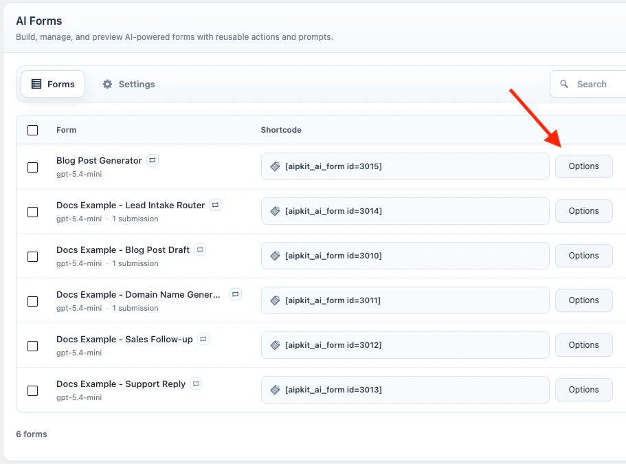
Manage Forms
The Forms tab lists saved forms with their title, model, shortcode, updated date, and actions. Each row has direct Edit and Preview actions. Select one or more forms with the row checkboxes to use bulk actions such as duplicate, export, or delete.
Imported forms are added as new forms. Existing forms are not overwritten.
Publish
Shortcode
Each saved form has a in the form list.123 with the form ID.
Click the shortcode snippet to copy it. Click Options beside the snippet to enable display options; the snippet updates as you change those options.
Examples:
Block
Use the AI Form block if you prefer the block editor.- Edit the page or post.
- Add the AI Form block.
- Select the form.
- Choose the theme and display options.
- Save the page.
Result Actions
Result actions appear after the form generates an output.
Save as Post uses the form title as the post title and saves the output as draft content.
Settings
Open AI Puffer > AI Forms > Settings. The Settings screen is split into tabs.Limits
Limits control how much AI Forms usage is allowed for guests and logged-in users. Open Limits.- Set Guest quota.
- Choose Quota mode for logged-in users.
- Set User quota or Role-based quotas.
- Choose Reset period.
- Edit Quota reached message.
- Configure optional primary and secondary buttons.
Reset periods are Never, Daily, Weekly, and Monthly.
Action buttons can link users to the usage dashboard, credits dashboard, purchases dashboard, buy credits page, or a custom URL.
Custom CSS
Custom CSS applies to forms embedded withtheme="custom".
Open Custom CSS.
Frontend Models
Frontend Models controls which models visitors can select when the shortcode or block shows the frontend provider or model selector. Open Frontend Models and select the models visitors can use. If no models are selected, all configured frontend models are allowed.Logs
Each form submission creates logs for the submitted request and the AI response. Logs include the form ID, submitted inputs, uploaded image metadata, constructed prompt, provider, model, token usage, vector search scores when knowledge base is used, and the generated response. AI Forms usage is recorded with:
This lets usage rules target all AI Forms or a specific form.
Troubleshooting
Form does not render
Form does not render
Check the form ID in the shortcode or block. The form must exist and be published. Admin users see shortcode errors; visitors see empty output.
Model dropdown is empty
Model dropdown is empty
Configure and sync the provider in AI Providers. If the frontend selector is enabled, also check AI Puffer > AI Forms > Settings > Frontend Models.
Prompt value is blank
Prompt value is blank
Check the field’s Field Variable Name in Element Settings and make sure the prompt uses the same placeholder, for example
{customer_message}.Required checkbox does not validate
Required checkbox does not validate
Make sure the checkbox field has options and that the visitor selects at least one option before submitting.
File upload fails
File upload fails
Use a TXT or text-based PDF file. If the server rejects uploads, check WordPress upload limits and security plugin rules.
Image upload fails
Image upload fails
Use a JPG, PNG, or WEBP image under 20 MB, and make sure the selected provider and model support image input. xAI image analysis accepts JPG and PNG images.
Save as Post fails
Save as Post fails
The visitor must be logged in and must have permission to create or edit posts.
Connected app recipe does not run
Connected app recipe does not run
Check that the recipe is enabled, the app connection is valid, the scope includes this form, and the recipe uses the AI Form Submitted event.
Workflow next form does not appear
Workflow next form does not appear
Check that the source form is saved, Enable Workflow is on, the target form still exists, and the source and target are not the same form. Workflow appears only after the source AI response completes.
Workflow values are not prefilled
Workflow values are not prefilled
Check the target field names and the workflow mappings. Mappings can prefill text input and textarea fields in the target form. File upload and image upload fields are not prefilled.
Workflow next form does not auto-submit
Workflow next form does not auto-submit
Check that Auto-submit next form is enabled on the source form and that the target form has all required values after mappings are applied. Required uploads and multi-step target forms wait for the visitor.