Documentation Index
Fetch the complete documentation index at: https://docs.aipower.org/llms.txt
Use this file to discover all available pages before exploring further.
Overview
WordPress Utilities are AI Puffer tools that appear inside normal WordPress admin screens. Use them when you are already reviewing posts, pages, products, or editor content and want to update or index that content without opening a full module screen.Bulk Assistant
Update selected posts from the list screen.
Row Assistant Menu
Generate title, excerpt, meta, or tag suggestions for one post.
Content Indexing
Send selected posts to a vector store, index, or collection.
WooCommerce Assistant
Use Assistant from the Products list.
Classic Editor Assistant
Run AI actions on selected text in the Classic Editor.
Block Editor Assistant
Run AI actions from the block toolbar.
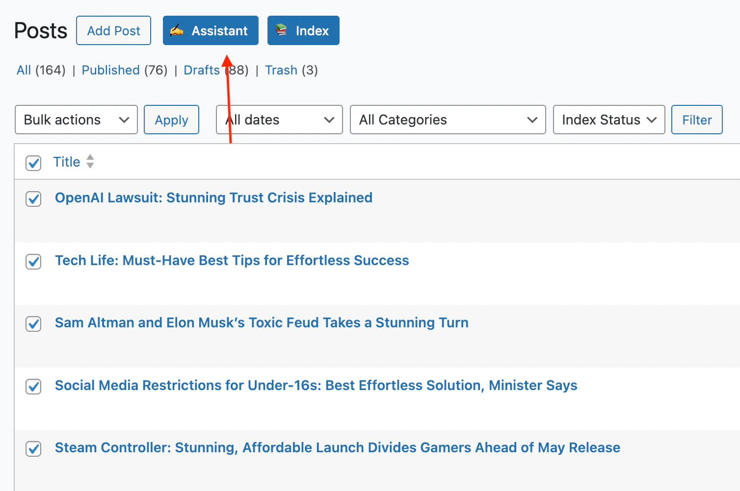
Bulk Assistant
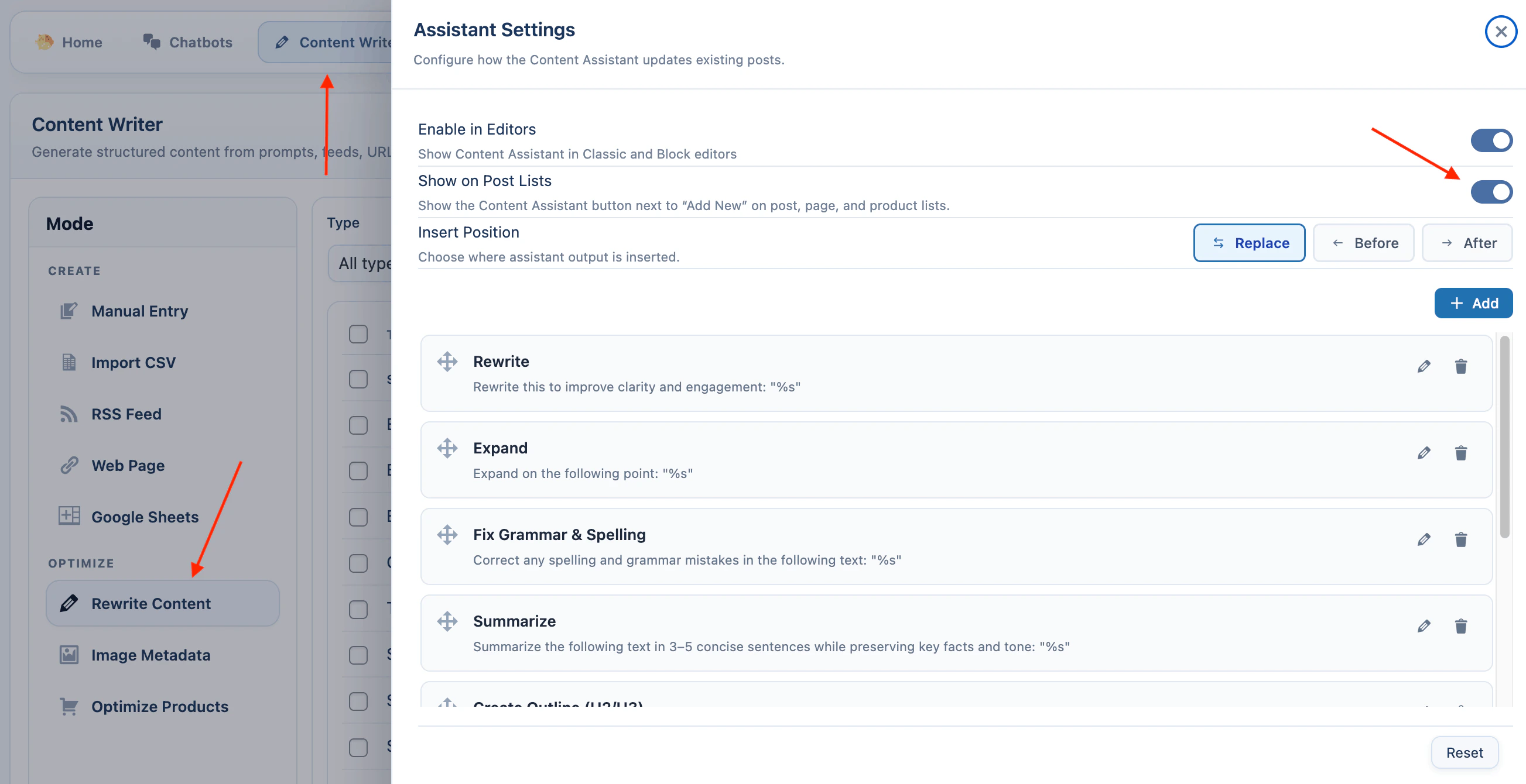
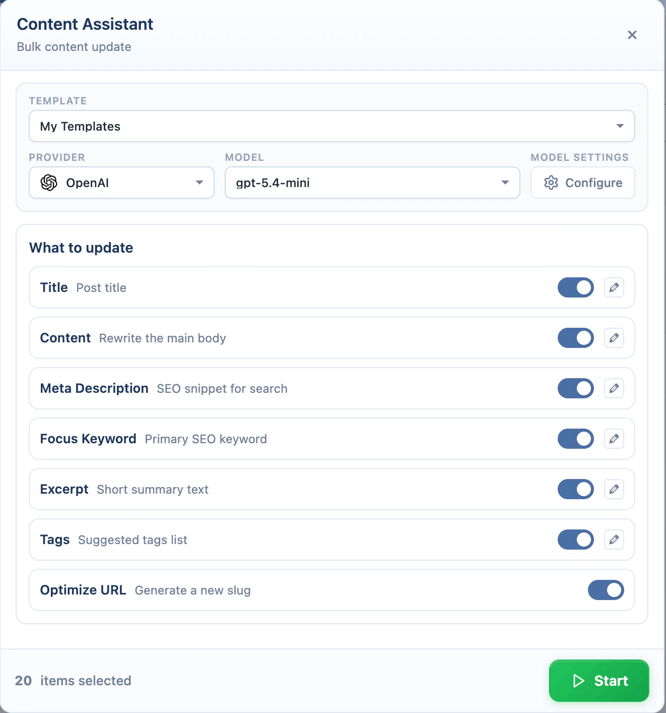
Bulk Assistant appears as an Assistant button next to Add New on supported post list screens. Use it when you want to update several posts, pages, or products in one run. It can update title, content, meta description, focus keyword, excerpt, tags, and URL slug. To enable the Assistant button:- Go to AI Puffer > Content Writer.
- Under Mode > Optimize, select Rewrite Content.
- In the right column, click Configure assistant settings.
- Turn on Show on Post Lists.
%s in the prompt where the selected editor text should be inserted.
Row menu suggestions use the default AI provider and model from Settings > AI. Bulk Assistant lets you choose the provider and model before running.
- Go to a WordPress post list, such as Posts, Pages, or Products.
- Select one or more rows.
- Click Assistant next to Add New.
- Select a template if you want to reuse saved settings.
- Choose the provider and model.
- Under What to update, enable the fields you want to change.
- Edit a prompt if needed.
- Open settings if you want to adjust creativity, content length, reasoning, or Knowledge Base context.
- Click Start Processing.
- Review the progress log before closing the modal.
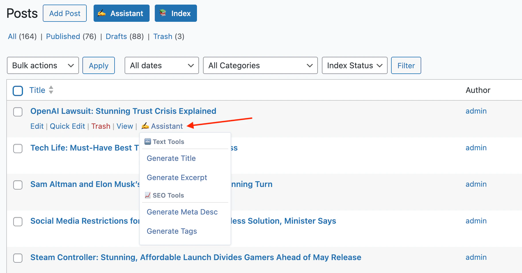
Row Assistant Menu
The row menu is for one post at a time. Hover over a post row and click Assistant to open the menu. It includes:| Action | What it does |
|---|---|
| Generate Title | Creates title suggestions from the current title and content. |
| Generate Excerpt | Creates excerpt suggestions from the post content. |
| Generate Meta Desc | Creates SEO meta description suggestions. |
| Generate Tags | Creates tag suggestions. |
- Go to a supported post list.
- Hover over a row.
- Click Assistant.
- Choose an action.
- Wait for suggestions.
- Click the suggestion you want to apply.
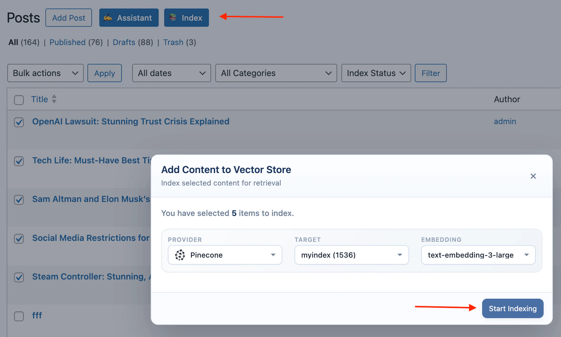
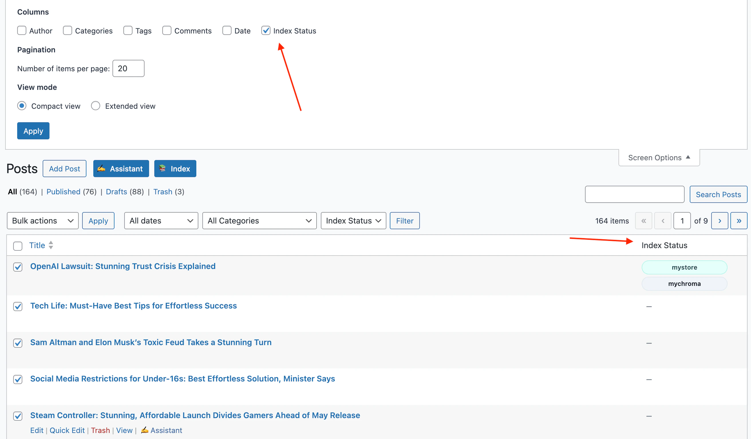
Content Indexing
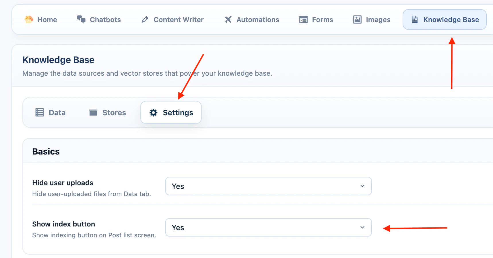
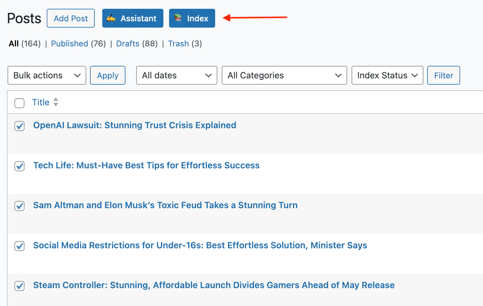
Content Indexing appears as an Index button next to Add New on post, page, and product list screens. Use it to add selected WordPress content to Knowledge Base retrieval. To show or hide the Index button:- Go to AI Puffer > Knowledge Base > Settings.
- In Basics, turn Show index button on or off.
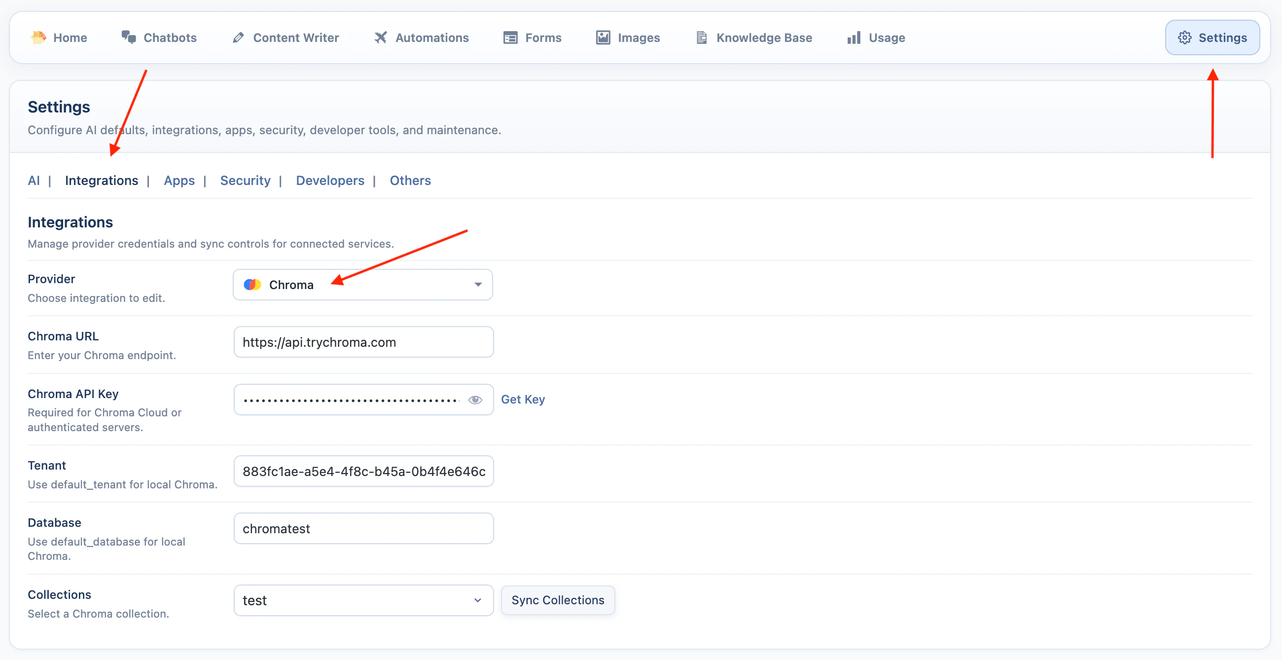
| Provider | Target | Extra requirement |
|---|---|---|
| OpenAI | Vector store | Select an existing OpenAI vector store. |
| Pinecone | Index | Select the same embedding model that matches the index dimension. |
| Qdrant | Collection | Select the same embedding model that matches the collection dimension. |
| Chroma | Collection | Select the same embedding model used when the collection was indexed. |
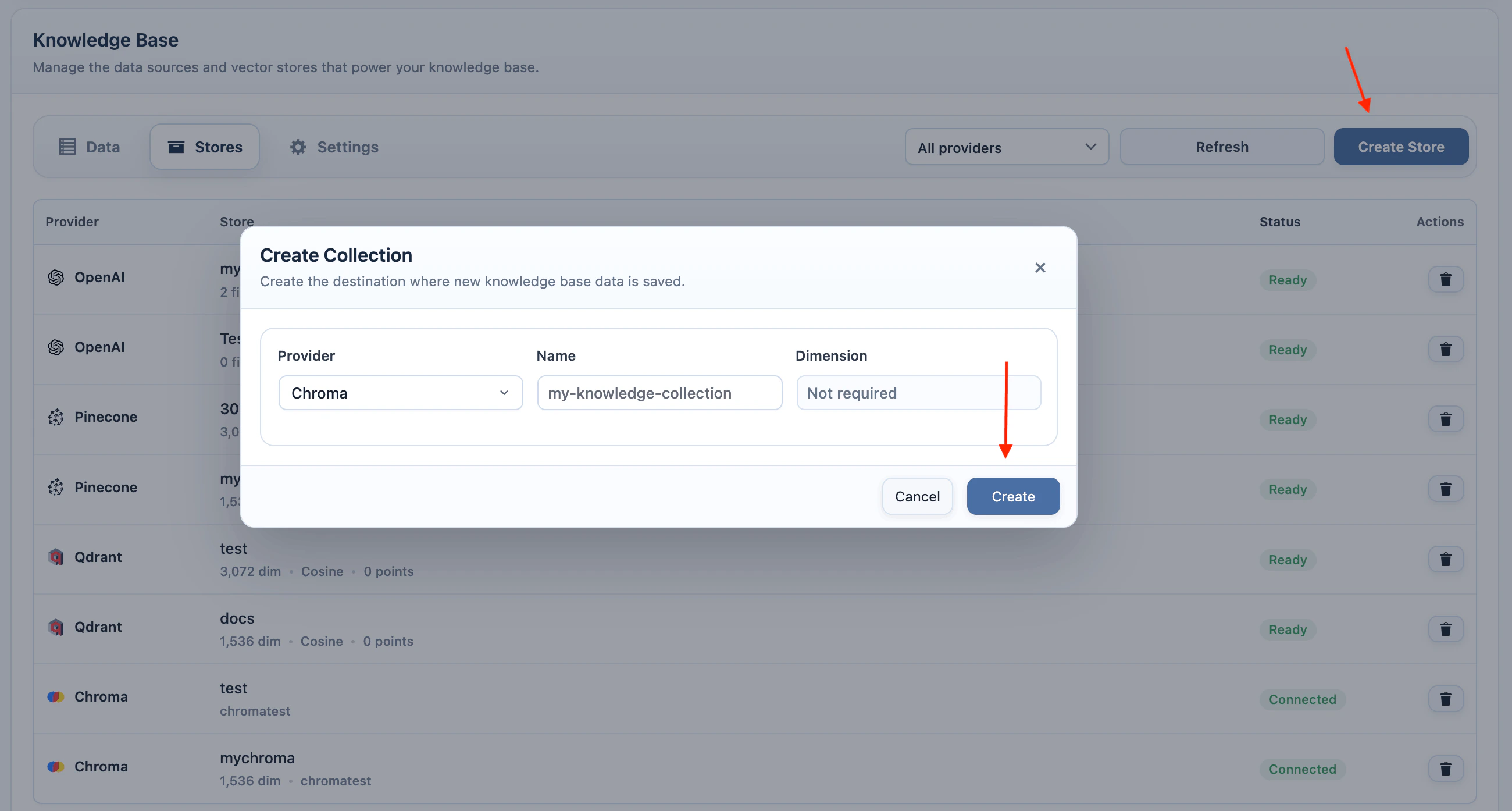
- Create or select the target in AI Puffer > Knowledge Base > Stores.
- Go to a supported WordPress post list.
- Select one or more rows.
- Click Index next to Add New.
- Select OpenAI, Pinecone, Qdrant, or Chroma.
- Select the target vector store, index, or collection.
- For Pinecone, Qdrant, or Chroma, select the embedding model.
- Click Start Indexing.
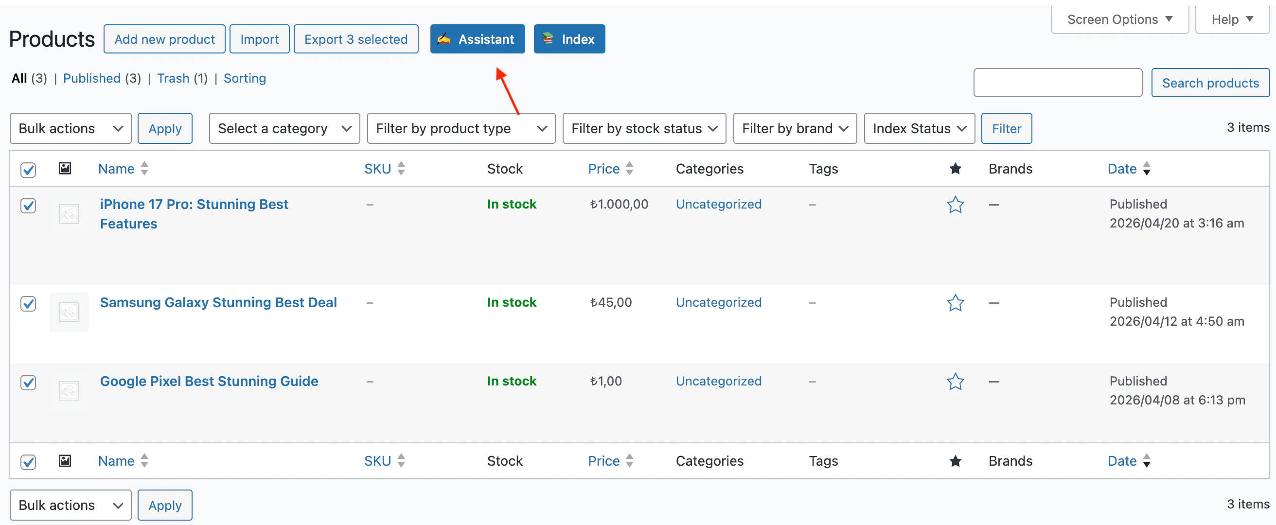
WooCommerce Assistant
WooCommerce Assistant uses the same Assistant tools on the Products list. Use it when you want to update product titles, descriptions, short descriptions, SEO fields, tags, or URL slugs from the product list screen. To use Bulk Assistant on products:- Go to Products > All Products.
- Select one or more products.
- Click Assistant next to Add New.
- Choose the provider and model.
- Enable the fields you want to update.
- Edit prompts if needed.
- Click Start Processing.
- Go to Products > All Products.
- Hover over a product row.
- Click Assistant.
- Choose Generate Title, Generate Excerpt, Generate Meta Desc, or Generate Tags.
- Apply the suggestion you want to use.
WooCommerce Assistant updates product content fields. It does not change price, SKU, stock, dimensions, or other product data fields.
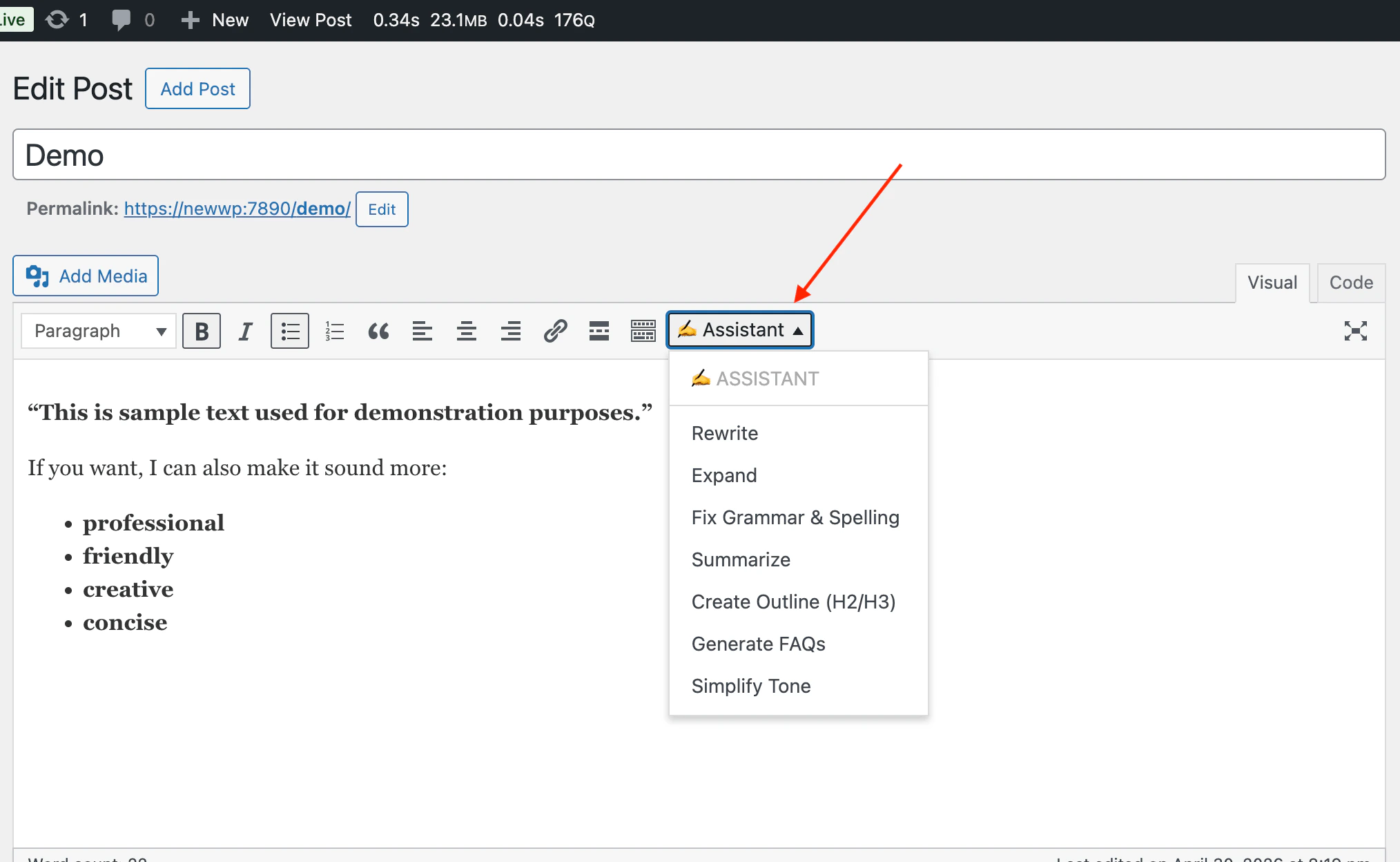
Classic Editor Assistant
The Classic Editor Assistant adds an Assistant dropdown to the TinyMCE toolbar. Use it to rewrite, expand, summarize, simplify, create outlines, generate FAQs, or run your own custom actions on selected text. To use it:- Go to AI Puffer > Content Writer.
- Under Mode > Optimize, select Rewrite Content.
- Click Configure assistant settings.
- Turn on Enable in Editors.
- Open a post or page in the Classic Editor.
- Use the Visual editor.
- Select the text you want to process.
- Click Assistant in the editor toolbar.
- Choose an action.
- Review the inserted output.
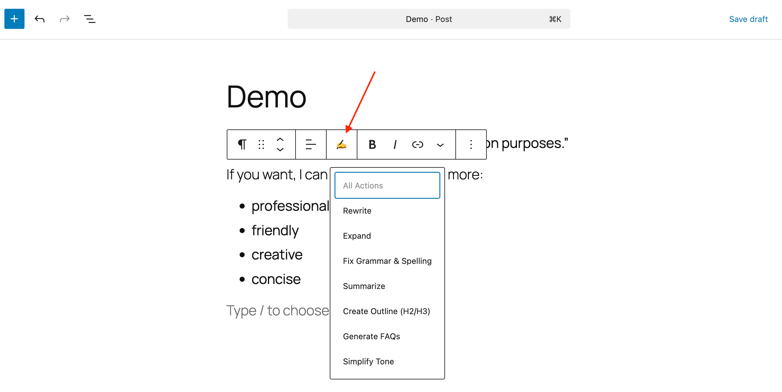
Block Editor Assistant
The Block Editor Assistant appears in the block toolbar when text is selected. To use it:- Go to AI Puffer > Content Writer.
- Under Mode > Optimize, select Rewrite Content.
- Click Configure assistant settings.
- Turn on Enable in Editors.
- Open a post or page in the Block Editor.
- Select text inside a text-based block.
- Click the Assistant icon in the block toolbar.
- Choose an action.
- Review the result.
Troubleshooting
Assistant button is missing on post lists
Assistant button is missing on post lists
Index button is missing on post lists
Index button is missing on post lists
Bulk Assistant says to select a post
Bulk Assistant says to select a post
Select one or more rows using the checkboxes in the WordPress list table, then click Assistant again.
Editor Assistant is disabled
Editor Assistant is disabled
Select text inside the editor first. The assistant actions need selected text because the action prompt uses that text as input.
Custom action ignores the selected text
Custom action ignores the selected text
Edit the action prompt and include
%s. AI Puffer replaces %s with the selected editor text before sending the request.Pinecone, Qdrant, or Chroma indexing fails
Pinecone, Qdrant, or Chroma indexing fails
Check the provider credentials, sync targets again, and confirm the selected embedding model dimension matches the index or collection dimension.
Suggestions fail or return provider errors
Suggestions fail or return provider errors
Check the default provider and model in Settings > AI. Row menu and editor assistant actions use that default configuration.